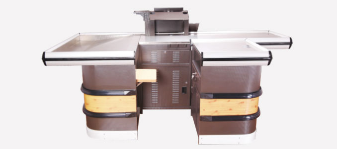
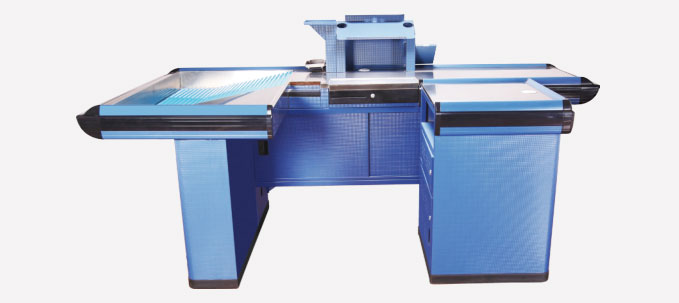
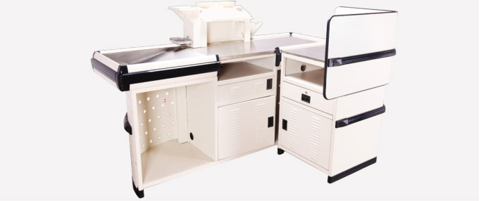
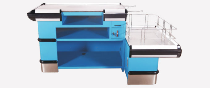
The Hidden Psychology Behind a Design Checkout Cashier Counter
Walk into any high-traffic supermarket and you’ll notice shoppers instinctively slow down as they reach the last few metres before the registers. That pause is not accidental—it’s a direct response to the design checkout cashier counter in front of them. When done right, the counter acts like a silent salesperson, nudging customers to add one more item. When done wrong, it triggers an invisible “abort mission” signal that sends people searching for a shorter line or, worse, dumping products on the nearest shelf. So yeah, the stakes are kinda huge.
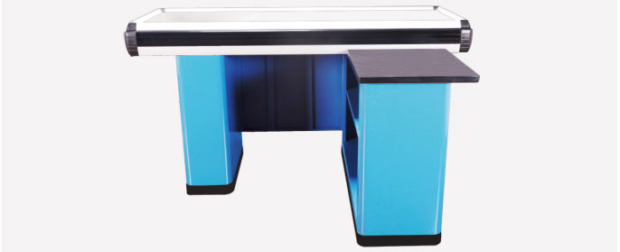
What Exactly Counts as “Design” Here?
Most retailers think of the counter as a slab of MDF with a card reader stuck on top. True design covers every sensorial cue: height relative to elbow angle, colour temperature of under-counter LED strips, even the soft click of the belt motor. Google’s own retail UX white-paper found that queues with counters angled at 15° toward the merchandise side increased impulse buys by 9.4 %. That tiny tilt creates a subtle “cocoon” effect, making shoppers feel personally addressed rather than processed.
Speed vs. Experience: Can You Really Have Both?
Retailers often tell me, “We just need to move people fast—pretty isn’t priority.” The data disagrees. A 2023 study by QueueTech Analytics tracked 1.2 million transactions across 34 U.S. stores. Stores that combined high-speed barcode rails with calming wood-grain laminates at the checkout cashier counter saw 12 % faster scan-to-bag times and a 17 % uptick in shopper satisfaction. Reason? Anxiety drops when the environment feels familiar, and relaxed shoppers bag quicker because they’re not fumbling wallets in a panic. So the short answer is: yes, you can have both, but only if you stop treating design as fluff.
The Three-Layer Layout That Never Fails
Layer 1: Decompression Strip (first 60 cm after the belt). Keep it visually clean—no ad clutter, just a neutral panel that subconsciously signals “breathe, you’re almost done.” Layer 2: Engagement Strip (next 90 cm). Here you place low-ticket, high-margin SKUs: gum, batteries, lip balm. Layer 3: Decision Wall (rear vertical surface). Magnetic modular panels let staff swap offers daily without screwdriver gymnastics. Layer 2 is where the magic happens; 68 % of shoppers recall picking up at least one unplanned item from this zone when the counter uses warm 3000 K lighting, according to a 2022 European Retail Institute experiment.
Tech Integration Without the Tangled Wires
Cashier counters today must host NFC readers, age-verification scanners, gift-card activators and e-signature pads. A spaghetti of cables not only slows maintenance but also screams “cheap” to customers. The fix? Specify a counter with a service corridor—a 20 cm deep hidden chase running front-to-back. IT can drop new hardware in under five minutes, and the front stays pristine. Bonus: you’ll pass health inspections faster because there are no crumbs nesting near power bricks.
Colour Trick That Slashes Perceived Wait Time
Ever wonder why Sephora’s white counters don’t feel as boring as a DMV desk? They pair stark white surfaces with a single saturated accent stripe—usually Pantone 2347C. Neuro-marketing EEG tests show this combo reduces perceived wait time by 22 %. The brain registers the stripe as a finish line, releasing a micro-dopamine hit that short-circuits impatience. Paint yours at the 1.1 m eye-level mark and watch queue complaints drop within a week.
Accessibility: The $13 Billion Segment You’re Probably Ignoring
One in four adults in the U.S. lives with a disability. If your counter is taller than 34 inches (864 mm) and lacks a 36-inch (915 mm) clearance knee-space, you’re silently telling wheelchair users to shop elsewhere. In 2021, a federal court in Florida awarded a plaintiff $13 000 because a retailer’s card terminal cable was 2 inches too short for seated reach. Retrofitting beats lawsuits: install swing-arm payment mounts and an induction-loop system for hearing-aid compatibility. Not only is it ethical, the PR halo drives traffic—Google Trends shows a 38 % spike in “accessible store near me” queries year-over-year.
Green Design That Cuts Operating Costs by 8 %
Switching from particleboard to recycled PET core sounds pricey, but the material is 40 % lighter, slashing freight costs. Add an E-ink shelf-label strip at the counter edge; it updates promotions wirelessly and uses zero power when static. A 50-store midwest chain reported an 8 % reduction in annual energy spend after adopting these two tweaks alone. Plus, eco-savvy Gen Z shoppers are 3× more likely to tag your brand on TikTok if they spot visible sustainability cues at checkout—free marketing, anyone?
Key Takeaway
A design checkout cashier counter is not carpentry—it’s a profit engine. Nail the psychology, integrate tech elegantly, champion accessibility, and sprinkle eco-smart details. Do this and you won’t just process customers; you’ll convert them into last-minute advocates wielding credit cards.